In Part 2 we covered the functions for creating coordinates for accurately representing shear reinforcement (stirrups and links) using an XY scatter chart in Excel.
In this third and final part, we’ll cover the functions for outputting the minimum lengths of stirrups or links. As mentioned in the first part in this series, estimating the total length of bars and hence weights can be a tedious boring process. These functions take out boring bits, but it’s still not ‘exciting’.
stirrup_length UDF
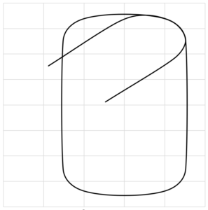
This function returns the length (in millimetres) of minimum length code compliant stirrup that is terminated with 135 degree hooks. If you need the answer in some other weird units (like imperial), then convert it afterwards.
=stirrup_length(vert_bar_ctrs, horiz_bar_ctrs, stirrup_dia, enclosed_bar_dia, main_bars, deformed_bars)| vert_bar_ctrs | vertical centres of the main bars (in millimetres) that the stirrup is going around |
| horiz_bar_ctrs | horizontal centres of the main bars (in millimetres) that the stirrup is going around |
| stirrup_dia | bar diameter (in millimetres) used for the link |
| enclosed_bar_dia | diameter of the main bar (in millimetres) that the link is going around |
| main_bars | TRUE for the link to adopt the minimum bend diameters for main bars, FALSE to adopt the minimum bend diameters for stirrups |
| deformed_bars | TRUE for the link to adopt the minimum bend diameters for deformed bars, FALSE to adopt the minimum bend diameters for plain round bars |
link_length UDF
This function returns the length (in millimetres) of a minimum length code compliant link or tie.
=link_length(bar_ctrs, stirrup_dia, enclosed_bar_dia, hook_type, main_bars, deformed_bars)| bar_ctrs | centres of the main bars (in millimetres) that the link is going around |
| stirrup_dia | bar diameter (in millimetres) used for the link |
| enclosed_bar_dia | diameter of the main bar (in millimetres) that the link is going around |
| hook_type | either 135 or 180 for a 135 or 180 degree hook |
| main_bars | TRUE for the link to adopt the minimum bend diameters for main bars, FALSE to adopt the minimum bend diameters for stirrups |
| deformed_bars | TRUE for the link to adopt the minimum bend diameters for deformed bars, FALSE to adopt the minimum bend diameters for plain round bars |
You can obviously convert these to your own local code requirements, or extend it further by wrapping these up in your own User Defined Functions (UDF) to say calculate the total length in a full stirrup set, or weight of reinforcement in a stirrups set. Factor in the stirrup set spacing and the member size and you’ve got yourself a weight of reinforcement per cubic meter. You can play Quantity surveyor all day long…..
Depicting longitudinal reinforcement…
Getting back to serious engineering….
While there’s probably 101 different ways you could go about representing longitudinal reinforcement on an XY scatter chart. I’ve found simply using circular markers is good enough for me. That is enhanced by figuring out that you can scale the marker size using VBA to give a good representation of the actual/relative bar sizes based on the scale of the chart.
It’s not perfect like generating and plotting coordinates of multiple circles to represent the true size of the bars. Because the markers in Excel have a lower limit on their size, this makes them less than perfect, but it’s good enough and means that the bars are still able to be seen at smaller scales. Also using markers means you can use ‘fill’ to colour them or make them look like a solid shape rather than just a circular line.
So how do you do this you might ask. Easy…
Getting your chart to scale
Firstly, let’s get your chart to scale: –
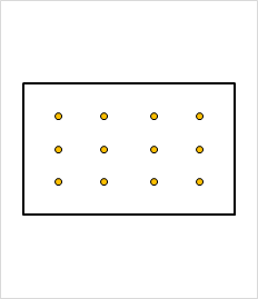
By default, for a XY scatter chart Excel tries to scale the axes so the data fills the full axes. If you are trying to show something to scale, this clearly can result in the data being shown that represents your section clearly not being to scale.
For example, in the following picture Excel is simply trying to ensure all the data points are plotted in the plot area, so it sets the extents of the axes to suit: –
Luckily, you can read a few properties of the chart and plot area and determine the length of the axes. Knowing this we can manipulate the axes minimum and maximum values to produce a chart that has a 1:1 relationship for the X and Y axes divisions based on the size of the chart on the sheet. Combine this with a Worksheet.Change event tied to specific inputs related to the scale of the section and you’re good to go.
The following code achieves this, reading off the width and height of your charts plot area, and comparing the axes length we can manually set the minimum and maximum axes limits, so we achieve the same scale for the divisions on each axes.
The data you are plotting for your section should be generated so it’s centered on (0, 0) coordinates. A bit more on how to run this later.
Private Sub rescale_graph(chart_name As String, data_width As Double, data_height As Double)
'module to update scaling so scale is similar on both axes
    Dim objchart As Object

    Set objchart = Sheet1.ChartObjects(chart_name)

    Dim plot_width
    Dim plot_height
    Dim horiz_ratio
    Dim vert_ratio
    Dim plot_ratio

    Dim fudge

    'SLIGHT FUDGE TO GET THE CORRECT ASPECT RATIO WHEN PRINTED
    fudge = 0.93235999999

    'axes width in points
    plot_width = objchart.Chart.PlotArea.InsideWidth

    'axes height in points
    plot_height = objchart.Chart.PlotArea.InsideHeight

    plot_ratio = plot_width / plot_height

    horiz_ratio = data_width / plot_width

    vert_ratio = data_height / plot_height

    If horiz_ratio > vert_ratio Then
        'plot height less than plot width and section width wider than section depth
        objchart.Chart.Axes(xlCategory).MinimumScale = -data_width / 2
        objchart.Chart.Axes(xlCategory).MaximumScale = data_width / 2
        objchart.Chart.Axes(xlValue).MinimumScale = -data_width / 2 / plot_ratio / fudge
        objchart.Chart.Axes(xlValue).MaximumScale = data_width / 2 / plot_ratio / fudge
    Else
        objchart.Chart.Axes(xlCategory).MinimumScale = -data_height / 2 * plot_ratio * fudge
        objchart.Chart.Axes(xlCategory).MaximumScale = data_height / 2 * plot_ratio * fudge
        objchart.Chart.Axes(xlValue).MinimumScale = -data_height / 2
        objchart.Chart.Axes(xlValue).MaximumScale = data_height / 2
    End If

    Set objchart = Nothing
End Sub‘data_width‘ & ‘data_height‘ are basically the overall range of the data/coordinates of your section you are trying to represent. This should include any margin you want around the perimeter. I suggest you do include a margin simply because if you are plotting a line on the edge of your chart Excel is good enough to cut off half the line width (thanks again Microsoft). So, for a 300 wide by 200 deep member, the member width + a margin (say 10-20) would be entered as the ‘data_width‘ variable. Similar for the member height + margin for the ‘data_height‘.
‘chart_name‘ is the name of your chart obviously. A point here, always name your charts. It makes it much easier to refer to them directly in VBA like this, when opposed to using the chart ‘number’ reference. This number Excel gives to each chart can change if you insert another chart, meaning you’ll break your code if you hardcode in the chart number. To name a chart, select it and type your name in the ‘Name Box’…… you know that box where you can name your cells. If you don’t name your cells, shame on you.
Going off-topic for a minute ….. Naming cells and using these in cell formulas is sometimes the difference between following and understanding this (usually in a year’s time when you forgot exactly how or what a certain formula was doing): –
…and not understanding this wall of gibberish cell references in a year’s time: –
We’ve all been here haven’t we…. Let’s move on!
Going back to the code, because Excel doesn’t print exactly to the same ratio as what’s on the screen (I have no idea why it doesn’t), there is a slight fudge required to the scales. You might have to play with this as it may be related to the aspect ratio of your monitor or even your printer. Who knows, ask Microsoft. But the value given seems to work on systems I’ve run this code on.
This ‘feature’ seems permanent after all the time that Office has been on the market, so don’t expect a fix. Print out a sheet and measure the vertical and horizontal scales and see if they are equal, adjust the fudge until they are.
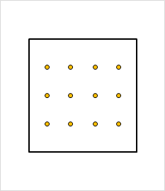
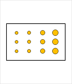
So with the above code we can turn this 300 wide by 200 deep section with a column of 16, 20, 25, & 32mm bars which is clearly not to scale, into the following to scale representation: –
Getting your markers to scale
Now that we’ve scaled the section, we can scale our markers to the right size: –
The following code takes your chart and scales the markers used for representing the reinforcement. The reinforcement is represented as several series consisting of X and Y coordinates of bars and scales the markers to the scale of the chart. This assumes that the chart is to scale (meaning the two axes divisions are to the same physical scale, what we achieved with the previous code essentially).
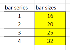
These series are named in a consistent manner, which takes a little discipline (easier if you have OCD no doubt). Create a different series of coordinates based on how many distinct groups of bars or different diameters that you want to show.
Private Sub resize_bars(chart_name As String, bar_size As Variant)
    Dim objchart As Object
    Dim plot_width As Double
    Dim axes_length As Double
    Dim axes_scale As Double

    Dim i As Integer
    Dim bar_marker_size As Double

    Set objchart = Sheet1.ChartObjects(chart_name)

    'axes length in points
    plot_width = objchart.Chart.PlotArea.Width    'axes length in points

    'total used length of the axes in unit lengths
    axes_length = objchart.Chart.Axes(xlCategory).MaximumScale - objchart.Chart.Axes(xlCategory).MinimumScale

    'ratio of width to length (dimensionless)
    axes_scale = plot_width / axes_length

    'loop through each chart series and update the marker (bar) sizes
    For i = 1 To UBound(bar_size)

        'excel seems to have a lower limit for marker size, size limited to 2 if calculated lower
        If bar_marker_size < 2 Then bar_marker_size = 2

        'determine bar size in points
        bar_marker_size = bar_size(i, 1) * axes_scale

        'change marker sizes for series named bar_series_# where # is a sequential number
        objchart.Chart.SeriesCollection("bar_series_" & i).MarkerSize = bar_marker_size
    Next i

    Set objchart = Nothing

End Sub‘bar_size‘ is a vertical range of cells representing the size of the bars in each series. With the series named ‘bar_series_1‘, ‘bar_series_2‘, etc.
Running this code on our previous example results in our markers being scaled appropriately to represent our bar sizes.
Conclusion
We’ve made it, easy right…..
So, we pull all this together with some code like the following example, on the assumption the data we are reading and the two modules above are located within the Module for ‘Sheet1‘ (change this as required): –
Sub run_test()
'module to test scaling section and reinforcement

Dim bar_size
Dim chart_name
Dim data_width
Dim data_height

'chart name
chart_name = "chart_name"

'vertical list of bar sizes
bar_size = Sheet1.Range("bar_sizes")

'data width is the total range of the X axis values inclusive of some margin
data_width = Sheet1.Range("data_width").Value

'data height is the total range of the Y axis values inclusive of some margin
data_height = Sheet1.Range("data_height").Value

'scale section
Application.Run ("Sheet1.rescale_graph"), chart_name, data_width, data_height

'scale bars
Application.Run ("Sheet1.resize_bars"), chart_name, bar_size

End Sub
If you want your chart to update dynamically and re-scale as things like bar size or section size changes, then link it to running on each change with a Worksheet.Change event.
There you go, go forth and be awesome.