One annoying thing about using charts in Excel to represent data is that by default it encourages you to define a finite sheet range to plot data. This can be annoying when you’re dealing with data where the total number of entries is dynamic.
For example, say you’re plotting a moment or shear diagram, you need to know the maximum number of data points beforehand to ensure you’re not missing out on any data being plotted at the end of the range. This number of points might be variable, for example, if you have some point loads then at each point load, you’re going to have two shear values, one to the left of the point load and one to the right.
This might have the effect of increasing the total number of data points you might be wanting to plot depending on the number of point loads you have, or the number of data points when say compared to the shear resulting from a UDL type of loading.
If you’re dealing with a dynamic amount of data, say that which might be returned from a dynamic array via a user-defined function or formula, then there is a way to have the plotted data range expand and contract to take account of the ‘length’ of the data. It’s just not that obvious to be honest (Excel being Excel), but it can be done relatively easily. This post shows you how.
Now the key to this is the dynamic data you want to plot must exist in a dynamic array format. However, you can also create an equivalent dynamic array from some static data (I mostly use the FILTER() function for this, if your data exists on its own sheet and could be of variable length then you can filter an entire column for anything that’s not blank and take out any headers. You’ll get your isolated data returned in a dynamic array, not the purpose of this post but it can be done easily).
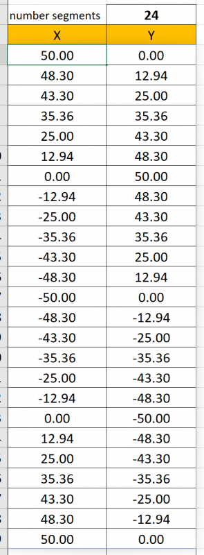
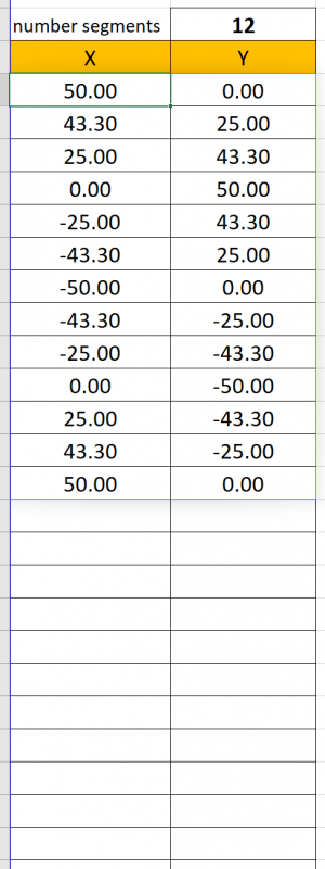
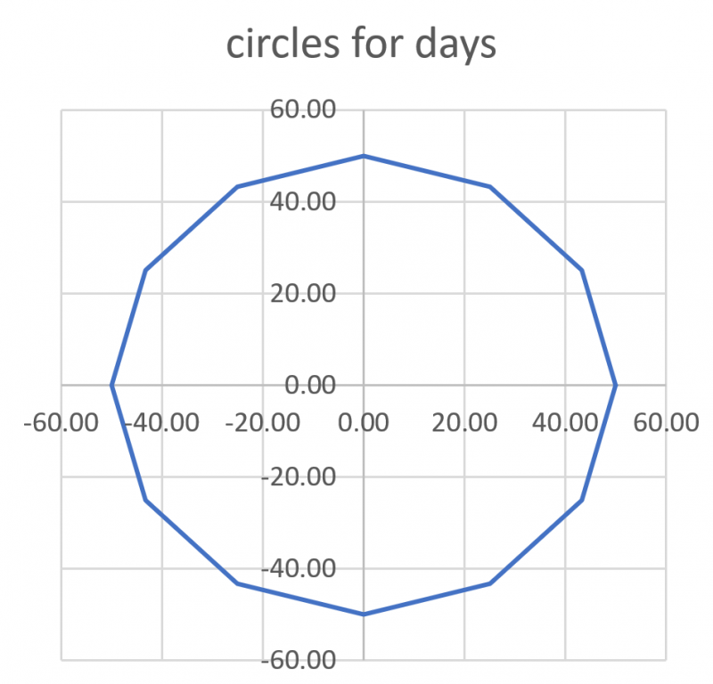
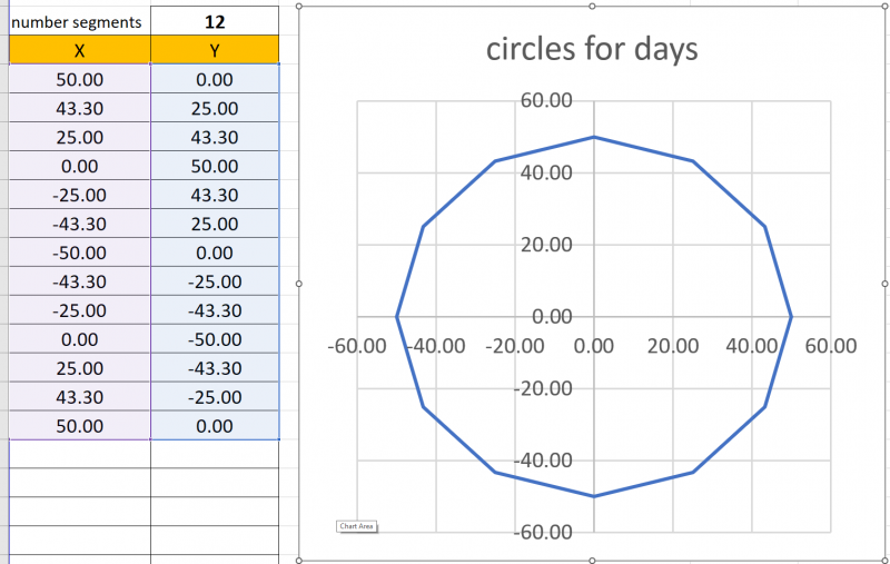
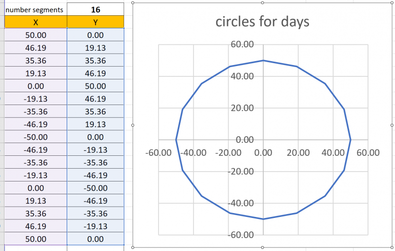
So, what’s the key here, well you need to define some named ranges that give the scope of the data you want to plot. For the purposes of this example, we will assume an XY scatter chart as it’s the most useful for representing a drawing of something like a circle. So let’s say we have a simple function that returns some geometry that describes a circle, and this is driven by an input for a number of segments which effectively gives the number of points we’re plotting around the circle. As you can see below this user-defined function is returning a dynamic array by the faint blue outline around the returned data when we change the number of segments: –
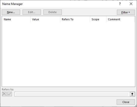
So firstly, we need to define some named ranges for the X and Y data ranges so we can utilise these named ranges in the chart X and Y values definitions. To do this we open up our Name Manager using the ribbon or CTRL+F3 shortcut: –
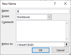
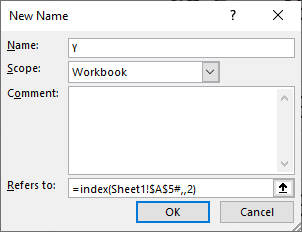
Click new, and the following window will open, here we define the range we want to refer to X and Y values.
We will create a separate range for both X & Y. Because we have our original dynamic array being two columns with X data in the first column and Y data in the second column we can use the INDEX() function to return just the X and just the Y data and assign this a named range. This means if the number of rows change in our original dynamic array, then the named ranges also change to match. This gives us a means of using the named range to plot the exact number of rows in our dynamically changing data without having to manually specify or hardcode the number of rows in the range being plotted.
By default the ‘Refers to:’ field will be populated by the currently selected cell. So go ahead and click into this field and select the top left cell of the dynamic array output. In my case, this is cell A5, but what we need to do here is wrap this in an index function to extract the first column which is our X values and also add the # symbol after the cell reference to tell Excel the range is a dynamic array. So, we end up with something like this: –

So to reiterate, the INDEX() function returns the first column of the specified dynamic array, i.e. our X values. If you just have a single-column dynamic array, then just enter this dynamic range, no need for the INDEX() function.
We do the same thing for the second column of the dynamic array containing the Y values:-
So here comes the bit that makes no sense because Excel can be retarded, you’d think having now defined these two named ranges you’d be free to simply just do the following, specifying in a chart that the X values should be ‘=X’:-
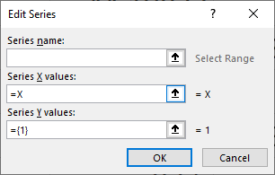
Nope Excel has other ideas…………
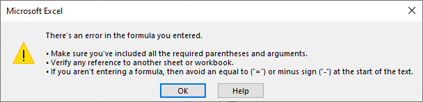
The issue is here for some reason we need to specify the sheet or the workbook name to give the scope of the named range. Kind of dumb because the named range already effectively defines the scope. But let’s just let Excel be Excel.
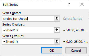
The easiest way to achieve this is to select say the X values field, then just click on the sheet, then delete the cell reference and write in our named range defined name:-
If you’ve done it right Excel won’t complain about the error, if you did it wrong check here and try again.
We are now greeted with a circle (or would be if we’d turned on smoothed lines)!
It’s worth pointing out here that if we go back into the chart data range for the series, we see Excel has replaced the prior sheet reference with the workbook reference. No idea why, it’s an Excel thing.
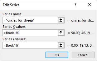
If we change the number of segments, we can see that indeed the dynamic-ness of the data has been achieved if we select the chart as it highlights the data ranges… $Profit$……
Good luck.