This is a handy technique that I was recently reminded of, using error bars to highlight values on XY scatter charts.
If you have an Excel chart you might often have the need to highlight a certain value of interest. Usually in these instances I’d plot another data series and add some markers to highlight these points. I’m often guilty of adding some additional horizontal and/or vertical lines as another series to the X and Y axis to enable easier reading off the values of interest.
These additional series for the lines are however quite redundant as you can achieve the same thing using the built-in error bars in Excel.
This takes a bit of a different path to setup to get the desired effect but it’s one less series you’re needing to generate data for on your sheet, and it keeps the clutter down in the chart Select Data Source window (if only you could resize this dialog box …… MICROSOFT!). I’m guilty of adding a lot of series to charts to finesse the look, so one less (usually) unnamed series suits me.
How?
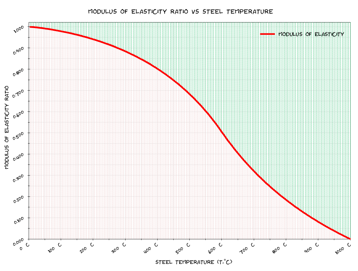
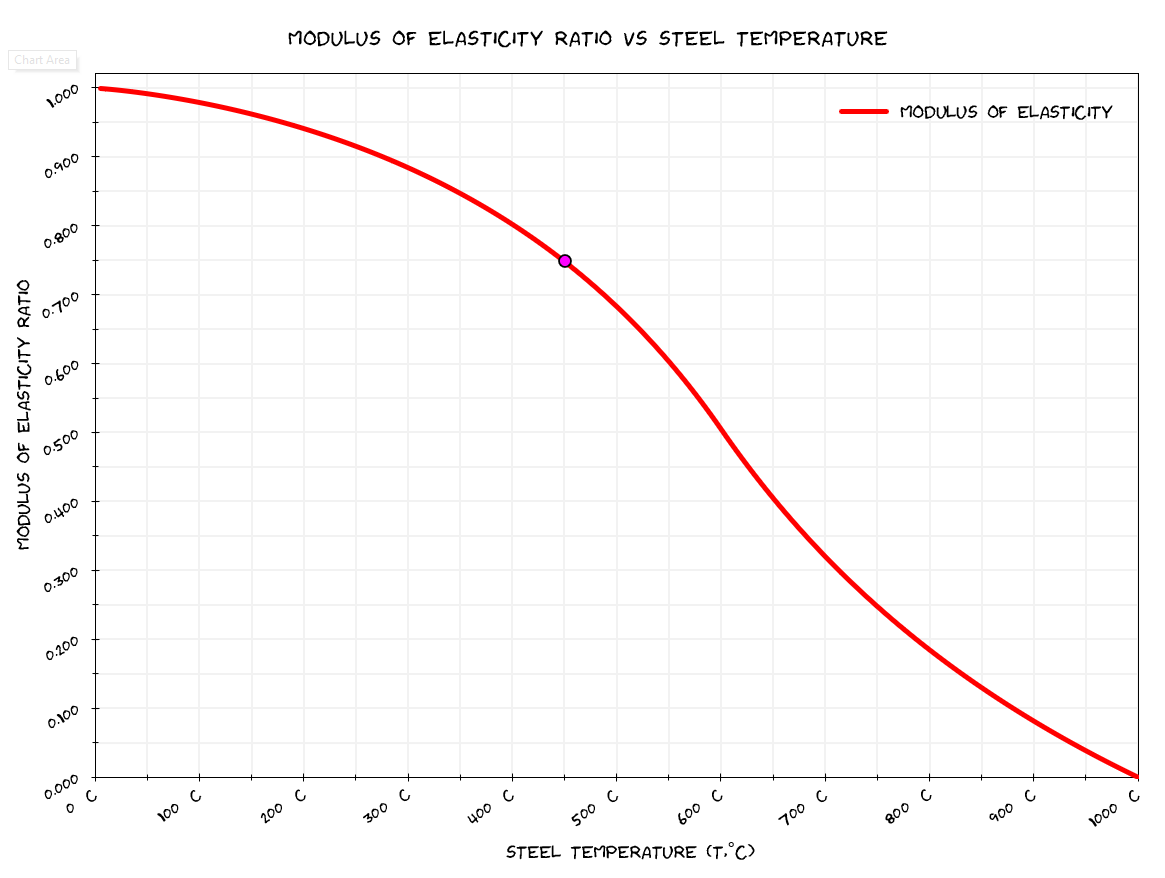
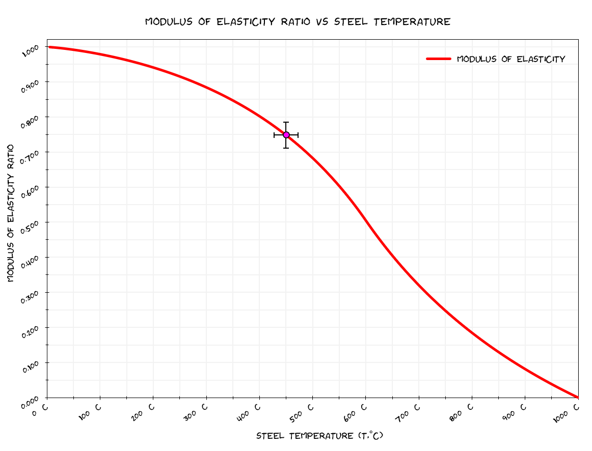
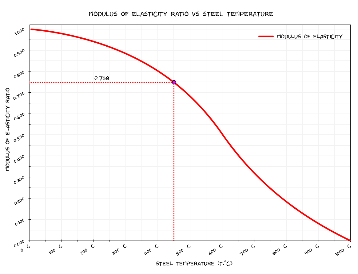
Let’s assume you have a chart that you want to highlight a particular value, in our case we have a plot of the variation in the modulus of elasticity of steel with respect to steel temperature (from NZS3404 standard), and we are interested in highlighting a data point which happens to be at 450 degrees centigrade. We have a series with that data point which is [x, y]=[450, 0.748] with a marker applied: –
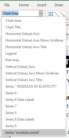
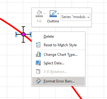
Now to add the error bars, select your series. The easiest way to do this is to select your chart, then via the Format ribbon menu that appears select the series, in this case the series for the marker was named modulus point.
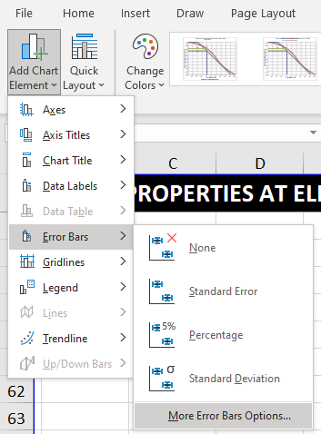
Now that we have the series selected you need to go to the Chart Design tab on the ribbon and select to add Error Bars, select Percentage: –
You should see some error bars appear that look like the following: –
Now if you click on the error bars and right click and select Format Error Bars the following formatting dialog should open on the right of the window: –
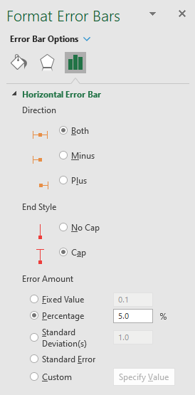
Now let’s say we want a horizontal & vertical line that extends across & down to the axes, the first thing we do is set the Direction to Minus, we can also set the End Style (I set to No Cap to hide the little lines), and to get the error bar to extend all the way to the axes we set the percentage to 100%. We rinse and repeat for the second direction. This should result in something that looks like below: –
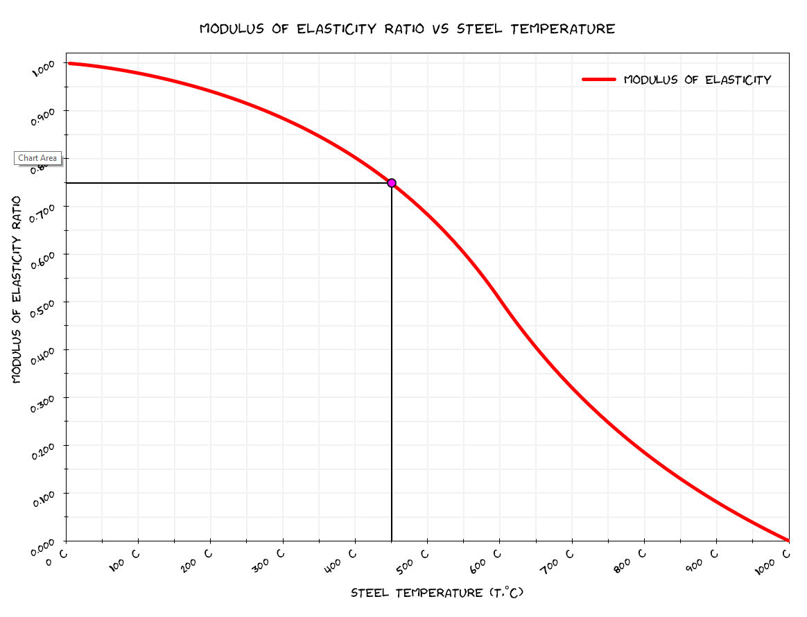
We can then select the error bars and format the line types to anything we want in keeping with what we want to convey (I also added in a sneaky little data label with the final ratio for the reduction to the ambient temperature Modulus of Elasticity): –
Wait there’s more….
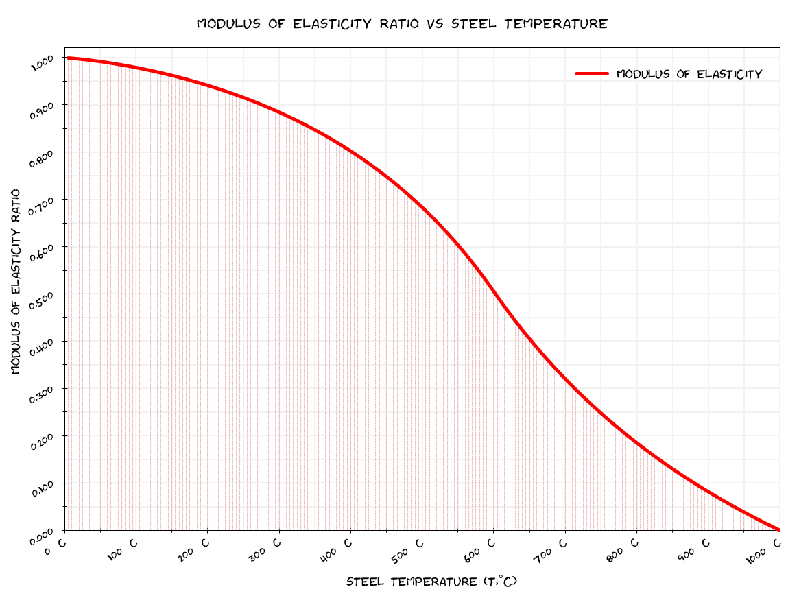
You can even apply this technique to provide a pseudo fill effect below an XY scatter chart if you have a regularly spaced data points, the intensity of the fill obviously depends on the spacing of the data points. This effect was demonstrated in the Excel file in this post with the plotting of moment and shear diagrams with a fill like effect. This was achieved in the exact same manner as noted above but applied to the main data series on a chart.
For our chart above, we would select the series with the data for our line, and apply the same steps: –
You could even add a second dummy series (without line or markers) and add a second set of error bars that you could format differently to highlight above the line…. use your imagination if you have one.
(but don’t go overboard like this, don’t let the sheep win!).